
A new trending color duo has emerged and it might just surprise you. Chartreuse and burgundy are the must-have colors of 2026 according to Google data. This combination — pairing deep wine tones with bright, vivid greens — first gained traction in the wedding industry before establishing itself in fashion, lifestyle, and home decor. Designers say this unexpected pairing is “surprisingly easy to incorporate into your home” in a way that feels elegant rather than merely trendy.
This color pairing is nothing new. These hues have appeared in interiors for centuries — in Victorian palettes, Art Nouveau patterns, and the bohemian waves of the 1960s and 1970s. The current enthusiasm for colorful, personality-filled, vintage-inspired interiors makes this revival entirely natural. The three designers consulted — Sophia deDomenico, Jessica Risko Smith, and Dorothy Parker — agree that restraint is essential with high-contrast color combinations. deDomenico recommends “taking it easy and creating patterns with intention over time.”
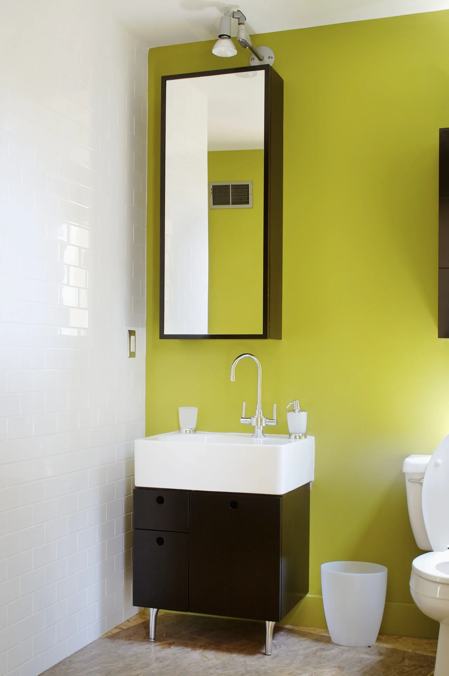
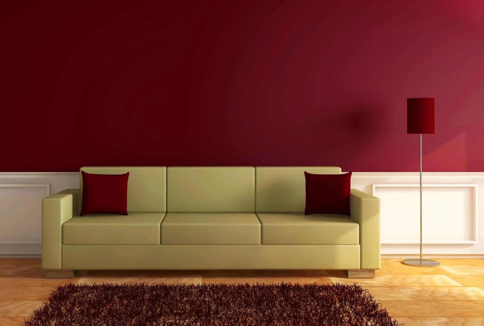
In the living room, the designers suggest using burgundy as a timeless base — via accent chairs, ottomans, or curtains in deep wine tones — then adding chartreuse in small doses, such as a vase or a patterned cushion. A patterned piece combining both hues plus a neutral helps the palette feel cohesive. The powder room is ideal for bold risks: “drench the walls or cabinets” in burgundy for a cocoon-like effect, with chartreuse then entering through decor and textiles.
In the bedroom, two approaches exist. The subtle version uses touches of color through accessories for a restful ambiance. The bolder version is a full color drench for a dimmed, cozy space, benefiting from a tertiary shade for balance. In the kitchen, it is best to avoid hard finishes such as tile and large appliances. Instead, opt for burgundy bar stools, dinnerware, or small appliances, and bring in chartreuse through glassware, linens, or fresh elements like limes, herbs, or green apples. Although bold, this pairing has deep roots in design history, which explains its effectiveness. Used thoughtfully, it feels sophisticated and surprisingly enduring.